This is an exercise and debate about how two world-class news/info designers could have competing (and maybe equally compelling) visions about how to tell stories from complex data.
Here are two (significantly, superficially) different visualizations from two designers using the exact same Census data on the exact same topic:
The point of this is not to think how you can emulate the level of polish and design of the New York Times or of Bret Victor, but to see how human-to-human storytelling principles and opinions can lead to different end products, despite the same data and design aesthetic. While you might not be able to reach the same level of polish, you can still exercise the same reasoning about the data and what's important to your users.
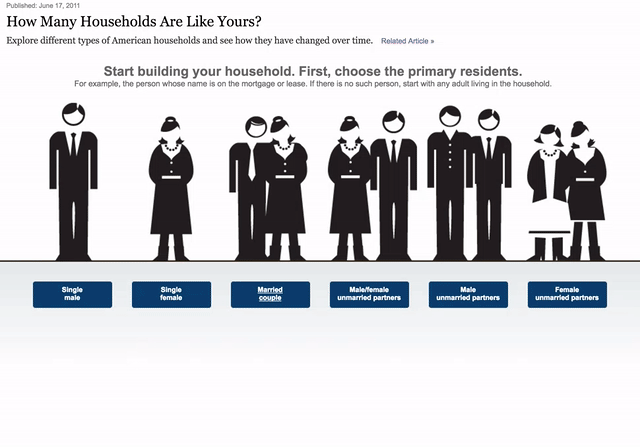
The New York Times shows off the Census household ata
Back in 2011, the New York Times asked,"How Many Households Are Like Yours?", and then invited its readers to find out, interactively, just how many other American families, based on the U.S. Census 2010 data, also consist of a husband, wife, mother-in-law, and 3 boarders, and an "Other non-relative".
(Related story: Baby Makes Four, and Complications)
Here's the raw dataset they used, just to show how dense and non-user-friendly the Census data can be:
http://www.nytimes.com/packages/text/newsgraphics/2011/06/19-households/chart_data6.txt)
Play around with the NYT app. What did it tell you about your household that you already knew, or didn't know? What did you learn about other families? What was not answered or not clear to you?
If you thought the app was great, that's great – the NYT was at the top of the data viz game in 2011 as they are now, so lots of people agree with you.
Bret Victor's rejoinder
However, if you thought the app was lacking – that the fact that the NYT made it doesn't absolve it from scrutiny of their design practices and aesthetics, then be reassured there's a well-known and highly-respected designer (formerly at Apple), who apparently was so piqued at what he saw as a user-hostile experience that he not only wrote a well-reasoned harsh critique, he rebuilt the app in his own vision using the NYT's data and assets:
To switch out the number shown through this peephole, the reader must interact. In this case, through a particularly convoluted navigation scheme, with no clear information hierarchy, peek-a-boo menus that appear and disappear, and "actions at a distance" — clicking the menu causes a far-away image to change, and clicking the image causes the menu to change.
But the confused navigation scheme is not the primary problem. The problem is that significant navigation is required at all. The reader must interact constantly. The reader must beg the graphic for every scrap of information.
Try Victor's app for yourself: http://worrydream.com/HowManyHouseholds#howManyHouseholds
Look up what you looked-up on the NYT's version. It's the same data, same look, different interface…has anything of note really changed? Victor claims that his version tells stories that are basically impossible to get from the NYT's app (and he's presumably done a lot less reporting/research on it than the NYT crew). What are those stories, or, what are the ones that stick out to you?
But try to give the NYT the benefit of the doubt. Even if you believe Victor's rhetoric, what do you think is lost the revamp? What things are prioritized and deprioritized? How does the very design reflect the creator and their intended audience?